
"A visitor may have a thousand reasons to visit your website, but ONLY ONE reason is enough never to return again"
Nowadays, more than 50% of website visitors use mobile smartphones and tablets to view content on websites, and this trend continues and is on the rise. In case your site is not responsive, there is a great chance that your visitors will not be able to properly use and browse the website. For example, they may experience a problem with viewing texts and photos, or navigation, and even be unable to access and use some parts of the site at all.
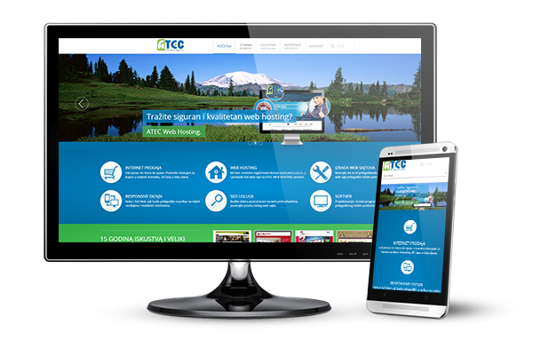
What is a responsive website?
A website is deemed to be responsive if the pages are adapted to the device and the size of the visitor's screen.
Responsive design is a method of creating a website that is visually and functionally customisable for all browsers (Chrome, Firefox, IE, Safari ...) and operating systems (Windows, Linux, MacOS, Android ...) , as well as for all devices (desktop and laptops, mobile phones, tablet devices, etc.). Generally, when a web site recognises the device and the resolution, it automatically adjusts the content and appearance to that device and detected resolution, displaying to a visitor a customised Web site with clear content transparency and navigation.